Customizing Links In The Header Navigation with CSS
Overview
This tutorial shows how to customize a single link in the header navigation using CSS code.
Step 1: Identify Which Link To Cusomize
Below you will see that we want to customize the 6th Link of "Level-0" in our header Nav.

Step 2: Compose CSS
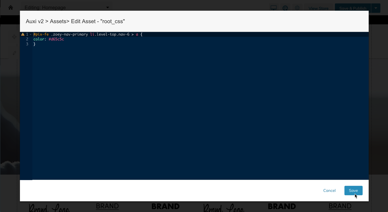
The above 6th link corresponds to the selector nav-6 in the below CSS code. You can replace this with whichever link you want to customize in your design.
/*For SANTI HEADER*/
#pix-fe .header-menu-container .zoey-nav-primary li.level0.nav-1 > a {
    color: #d65c5c;
}
/*Sticky Header*/
#pix-fe .header-scroll-container.is-scrolling .zoey-nav-primary li.level-top.nav-1 >a {
    color: #d65c5c;
}

/*For Single Header Blocks*/
#pix-fe .zoey-nav-primary li.level-top.nav-1 > a {
	color: #d65c5c;
}
Note:The above example shows how to change the link color to a light-red. You can add whichever styles you wish such as font-size, color, etc...
Step 3: Add CSS to Theme
Using the Asset Manager you can add the above CSS to your theme.

Click Save, then test your store.
Advanced
Background color might be on a different element depending on which Header Navigation block you are using.
You may also want to style the hover-states by using the :hover and :not(:hover) selectors.
Updated 11 months ago
