Layout Settings
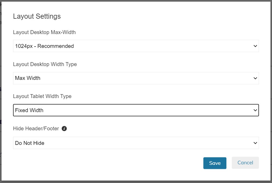
Layout Settings contain settings for your theme and page layout. You can specify things such as Page Width, or Hiding the Header and Footer.
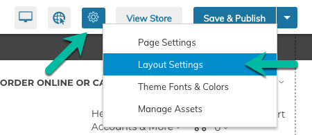
Layout Settings can be accessed within the Gear menu when in the Visual Design Editor:


Layout Desktop Max-Width
This setting allows you to specify the Maximum Width of your theme when viewed on "desktop" or any screen larger than 768px.

How Screen Sizes Work on Zoey
Zoey design is "Responsive" meaning the same design must be flexible enough to "respond" as the screen size reduces from the largest to smallest. We achieve this by using "break-points" or specific screen sizes that you will have the ability to make minor adjustments for. The breakpoints are:
- 768px - Tablet Break-Point
- 580px - Mobile Break-Point
Recomendations
- We recommend a Layout Desktop Max-Width setting of 980px and 1024px for the ease of design and for maximum compatibility across screen sizes and devices. It's important to note that most laptops range in size from 1024px to 1280px.
- Modern Web Design typically leans toward 1280px - 1366px options but the user must be aware that the design will need to scale down to 769px before "breaking" down to Tablet.
- We recommend not using 100% width unless you are very familiar with our design tools.
Layout Desktop Width Type
This setting allows you to choose "Max Width, versus "Fixed Width". We'll explain the difference and why you would want to choose either option below:
Max Width
This setting will limit the width of your design to the Layout Desktop Max-Width. This is our recommended setting for mid-level users that have some understanding of the information above. With this setting, the Desktop design will scale up to the set max-width, but will also scale down until it reaches 769px, then at 768px, it will snap to the "Tablet" break-point design.
Fixed Width
This setting will make your store NOT RESPONSIVE above 768px. That means regardless of the user's screen size, they will see your design at the same width as specified in the Layout Desktop Max-Width setting. While limiting, we highly recommend this setting for our beginner users who simply want the Desktop design to always look the same on all devices larger than a tablet. Ease of use and consistency are the key benefits, but the detractors are that if the users are on a device larger than a tablet, but smaller than the Layout Desktop Max-Width, they will see a horizontal scrollbar. For this reason, when using Fixed Width, we recommend also using a Layout Desktop Max-Width of 940px, 980px or 1024px at most. This will significantly limit the number of visitors that will have the horizontal scrollbar experience.
Layout Tablet Width Type
Like Desktop Width Type, we offer a setting to select Fixed or Max Width for screen sizes below 768px.
We highly recommend using Fixed Width for this setting. This recommendation is based on our data that shows less than 1% of users are viewing Zoey stores on devices between 580px (maximum mobile size) and 768px (Tablet size). With Fixed Width enabled, those users on mini tablet devices (like iPad Mini, Kindle Fire or Large Phones in Landscape view) will see the Tablet view and may have to pinch to get the full screen in view.
Alternatively, if you select Max Width, you will need to ensure your design is capable of scaling down from 768px to 580px. This is not a simple thing to do which is why we only recommend this for our most advanced users that are familiar with how block stacking works.
Header & Footer Stack Order
This setting allows you to specify if the header should be in front of the footer in the instance that it overlaps (such as with a long menu), or behind.
The only reason we have found that you would want to set the header to be behind the footer is if you have put Custom HTML into the "Foot" that needs to load on top of the header. This is a very advanced use-case. For that reason we recommend keeping the header above the footer.
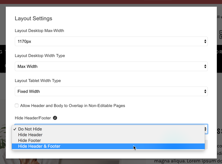
Hide Header/Footer
Use this setting to hide the Header and/or Footer on specific pages.

This setting only applies to the current page being edited, not the entire theme
Updated 11 months ago
