Mobile Design
Overview
The Mobile design of your theme allows for some minor flexibility such as the resizing of text, resizing of images, adding/removing padding, and hiding unwanted blocks. There are also some restrictions such as re-organizing blocks into a different logical order (what we call the "stacking order") of your desktop design.
Switching to Mobile View
When designing a new theme you should always check your mobile view to ensure the design looks good for mobile devices. Switch to mobile view by clicking on the 'devices' icon and selecting "Mobile".

Auto-Stacking
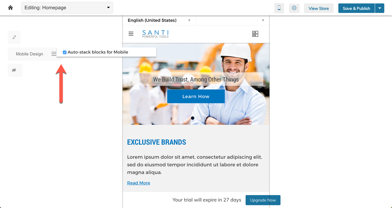
Auto-stacking is a toggle setting for the mobile view that allows you to automatically set your mobile design to the logical Stacking Order of your desktop design. The toggle lives in the 3-bar icon to the left of your mobile design:
What Is "Stacking Order?"
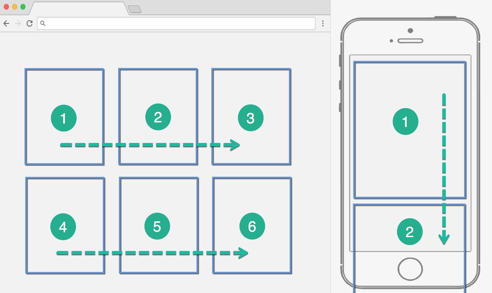
Stacking order assigns a logical order of objects from the desktop design. When translated to mobile, the order, which on desktop may contain horizontal and vertical alignments, transforms to mostly vertical. See below:
Blocks on mobile can be re-arranged as long as the Stacking Order is respected. Below you will see two examples where the above desktop design is arranged from 3 columns to 2 columns on mobile. In the first example, the stacking order is respected. In the second, the user is presented with the error:
Altering component order is not allowed in Tablet and Mobile mode.
This error appeared because block #2 is being dragged above block #1.
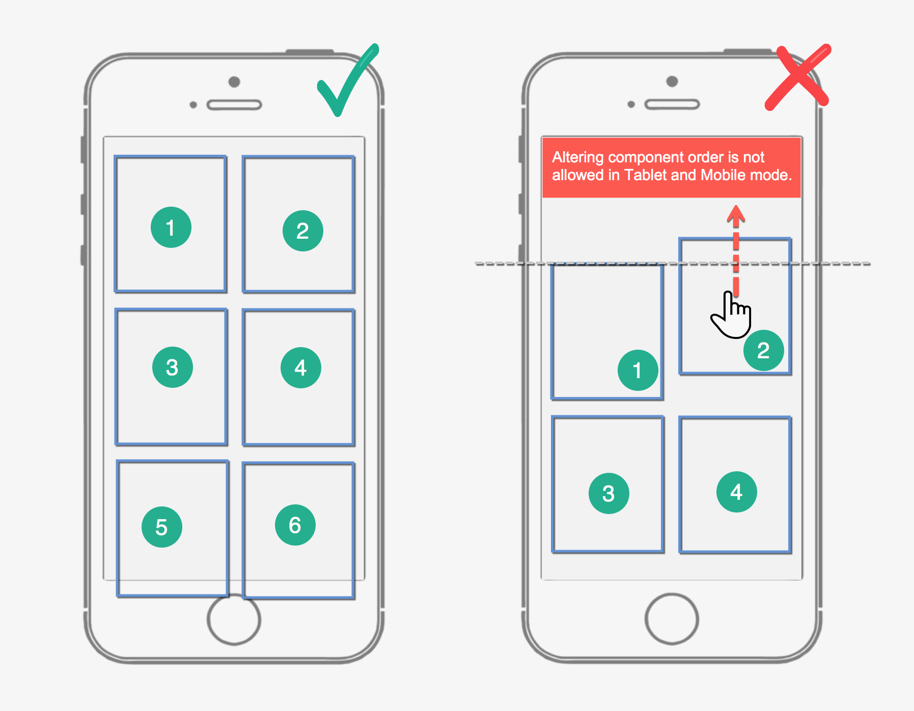
That error will appear anytime you move objects out of order. If this is happening to you on mobile, simply toggle the Auto-Stack blocks for mobile setting until all blocks are properly stacked.
Removing Gaps
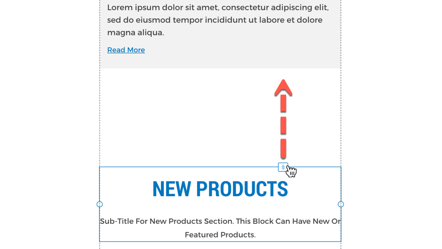
Sometimes logical spacing on Desktop does not translate well to mobile leaving large gaps between blocks, you can fix this by using the "push" icon on a block and sliding it up or down.
Hiding Blocks
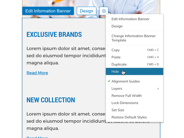
Some blocks are too large, don't make sense on smaller screens or simply push the important content too far down the page on mobile. These blocks can be hidden on your Zoey mobile design.
Right-click or click the Gear icon and select "Hide".
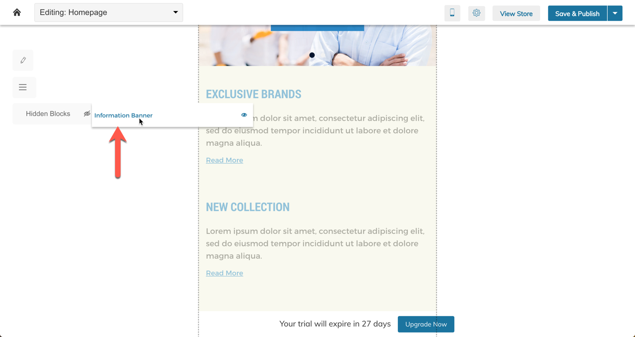
Hidden blocks can be restored using the "Hidden Blocks" menu. Hover to have them appear where they used to show. Click to restore them to your design.
Mobile-Only Blocks
Currently, Zoey does not have a feature to have Mobile-Only blocks.
Custom Mobile Header Blocks
In Mobile, your header will be hidden and in its place will be a Mobile Optimized Header. This means any custom blocks you added to your header will not appear on mobile.
Updated 11 months ago
