Mobile Header
Overview
In Mobile, your header will be hidden and in its place will be a Mobile Optimized Header. This means any custom blocks you added to your header will not appear on mobile.
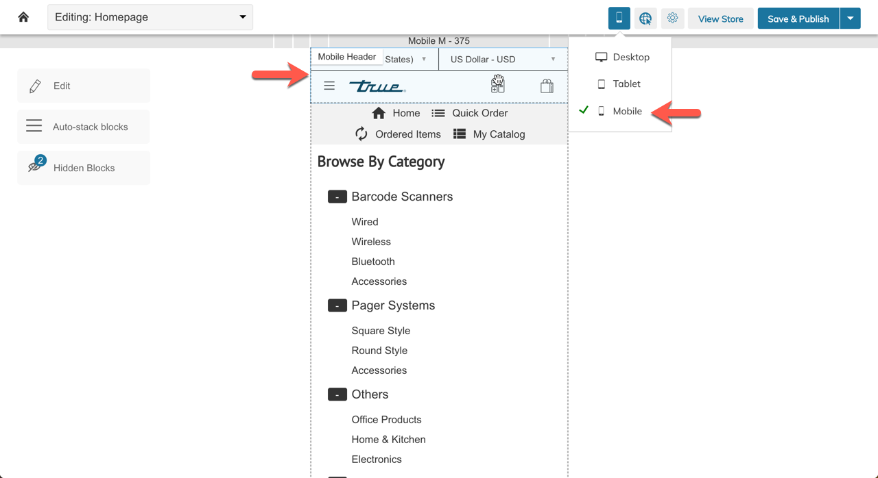
Any custom blocks you added to your header will not appear on mobile
Settings
Show Language and Currency
This setting enables the Language & Currency bar in the mobile header

Show Account Links
This setting enables the "My Account" Links to be added to the Mobile Menu (below the categories)
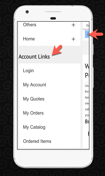
Account Links Title
This setting allows you to change the Account Links Title (defaulted to "Account Links") - see above screenshot.
Show Shopping Cart
This setting allows the hiding of the shopping cart link on mobile.
HTML Above and Below the Mobile Header
These two settings allow adding custom text, images or other HTML code (using a WYSIWYG Editor) to your mobile header.
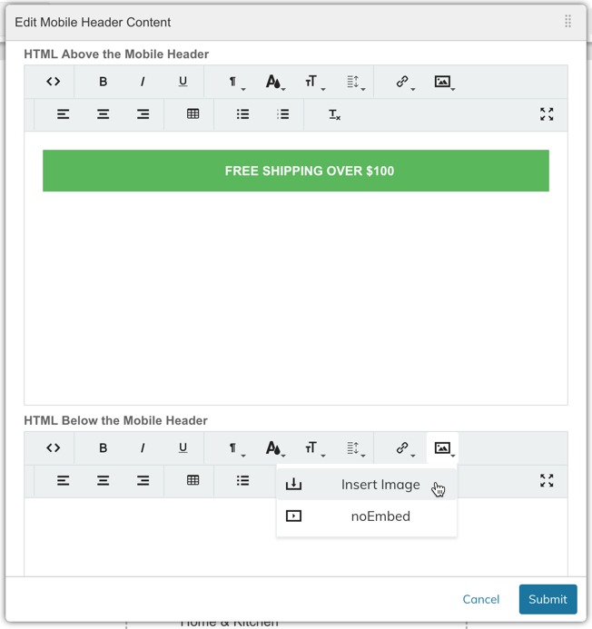
<ul>
	<li style="text-align: center; margin-bottom: 0px; margin-left: 0px; padding: 	16px 10px 16px 40px; font-weight: bold; color: rgb(255, 255, 255); background-	color: rgb(91, 183, 91); position: relative;">FREE SHIPPING OVER $100</li>
</ul>
Choosing A Different Mobile Header
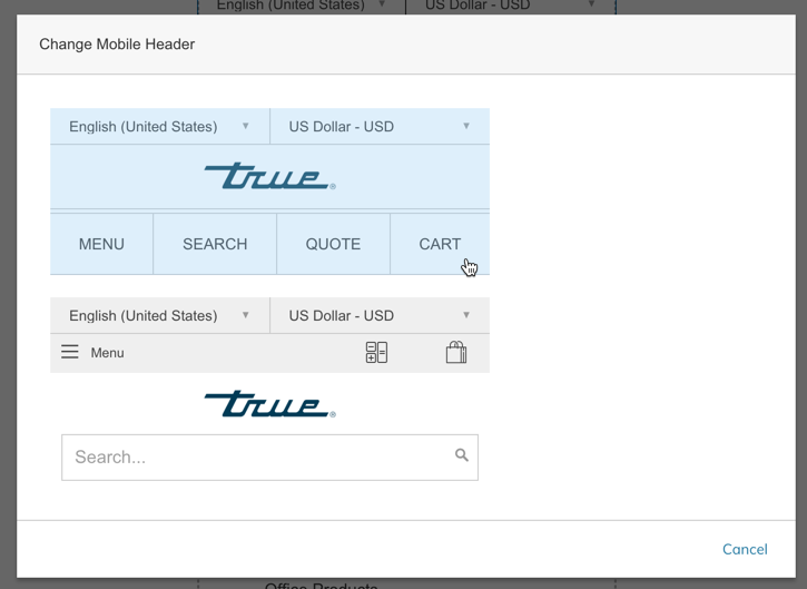
Zoey has three different Mobile Optimized Headers. If you want to change the Mobile Header Template, right-click or click the gear icon on the block and select "Change Mobile Header Template" (see below).
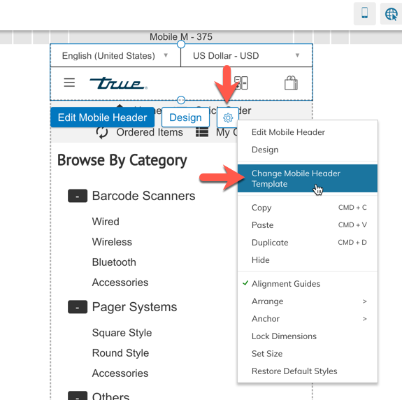
This will open a window where you can select from the other available templates.
Updated 11 months ago
