Creating A Multi-Column Layout
Two, three and four column layouts
Creating your own custom "Multi-Column Layout" requires the use of "Boxes" and a little bit of simple math. In the end we will achieve a design that has multiple blocks in many different column formations, maintains perfect spacing and is perfectly responsive to Tablet and Mobile.
Example Multi-Column Layout

Be sure to read the Boxes tutorial herehttps://support.zoey.com/docs/boxes#how-does-resizing-with-boxes-behave
Step 1: Know Your "Layout Settings"
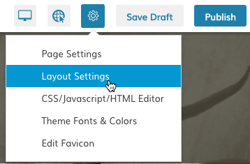
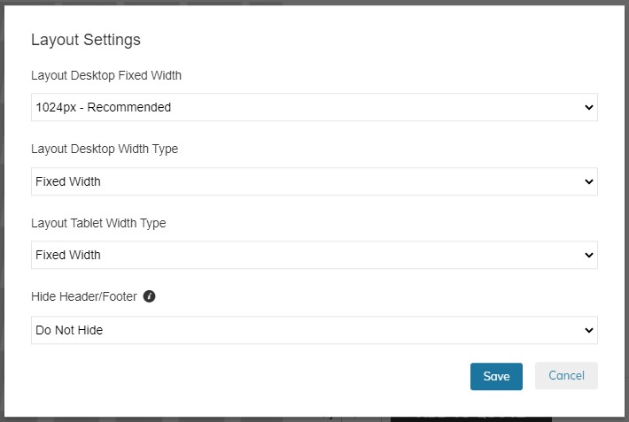
In order to create columns you will need to know the Maximum or Fixed width of your layout. You can find this in the Page Editor under Gear Icon>Layout Settings


Here you see that your layout is 1024px
Step2: Know Your Page Body's Padding
The body of your page may have some additional padding on the left and right. You will need to know this to do your calculations.
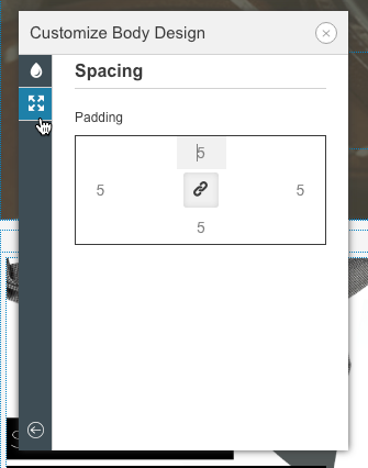
Right-Click on the body and select "Design" and click on the "Spacing" section.

Here you see 5px padding added to the body.
Step 3: Calculate Your Columns
Here we will do simple math:
Our body is 1024px wide, but has 5px padding on the right and left. So our 1 column layout is actually 1014px. See the table below for further column width calculations:
# of Columns | Column Pixel Width |
|---|---|
1 | 1014px |
2 | 507px |
3 | 338px |
4 | 253.5 |
This math can be applied to any of our Layout Setting Page Widths.
Updated 11 months ago
