Building Your Own Theme
For Advanced Users OnlyWe recommend only advanced users and developer partners attempt to build a theme from scratch.
- Our pages are intended to utilize the design elements we provide. You should not be building pages with HTML/CSS.
- The HTML Block is intended for inserting or embedding widgets, not for building responsive pages.
- The CSS tool is to be used for styling and decoration only, not for positioning (margin, position & float will break your visual design editor).
Zoey Customer Support will not be able to assist with issues relating to custom HTML, CSS or Javascript.
Design First
Zoey mimics a web-version of Photoshop but we highly recommend that you perform wire-framing and design inside of software like Photoshop, Illustrator or Sketch. (Unless you are very familiar with the concepts below)
Understanding Page Structure
Before starting to add blocks to your page, take some time to outline the structure of your page's columns and rows that will group your content into logical Boxes that will resize and stack as the page changes screen size.
Build this structure using Boxes before adding your Blocks. Utilize the Spacing feature in the Design window for each box to ensure that when content is added, it follows the spacing defined in your design.
View how the Boxes move in tablet and mobile and make as many adjustments now. Once you add content, this process becomes much more difficult.
Decide On The Best Layout Settings
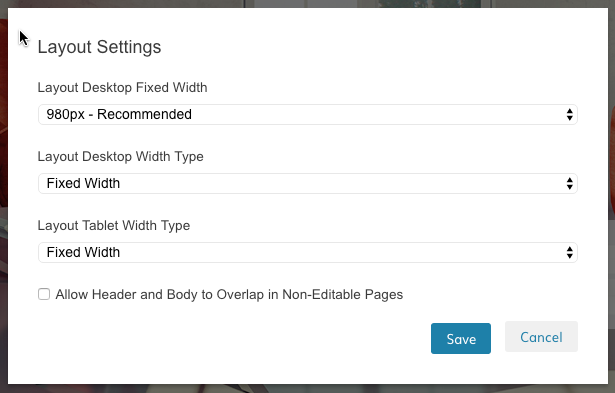
We recommend for your first theme to utilize a max or fixed width for desktop. This will simplify the design process and speed development time.

Most themes work perfectly with a Fixed or Max width, especially since you have "Strip" blocks that can still give you that look & feel of a full width theme.
If you choose to go with a 100% width, understand that the complexity has increased and it will very likely take longer to complete and test your theme.
Tablet Width Type: FixedZoey recommends setting Tablet Width Type to "Fixed Width". Less than 1% of screen resolutions for all Zoey Stores in 2015 was smaller than 768px and larger than 540px (where mobile begins). Therefore we recommend designing only for the smallest tablet size with a marketshare above 1%.
Save & Back-Up As You build
We recommend as you take your next steps to designing your theme, that you save or publish often and Duplicate your theme to make incremental back-ups.
Adding Content
The subsequent tutorials will assist with adding and manipulating content to achieve the design you are looking for.
Also See: |
|---|
Updated 12 months ago
