Adding a Mobile Only Image to Slideshow
Review our resources for designing your Store here.
Overview
When designing your store, you must take into account that customers may view the site using a variety of devices. Zoey will manage much of the reformatting for mobile automatically. But, if you intend to add a large banner image or slideshow, you must consider how that image would be resized for Tablet and Mobile visitors.
In the Theme Editor, there are special web elements which can display a smaller banner image for mobile devices.
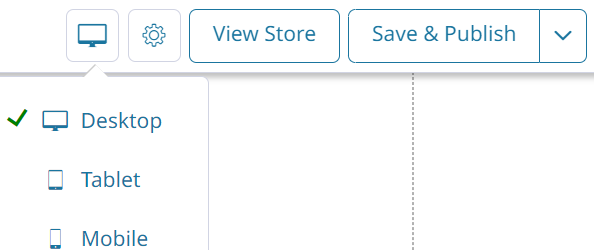
Viewing your Store as Table or Mobile
When editing your design, there is an Icon resembling a computer monitor. Click on it to change how you are viewing your store without needing to publish.
Auto-stack Blocks
When viewing your store in Mobile format, the elements may appear jumbled or layered atop each other. This will not be the case when viewed naturally through a mobile device.
Click Auto-stack blocks to automatically correct how the mobile view is being displayed to you.

Creating a Mobile Image Slideshow
-
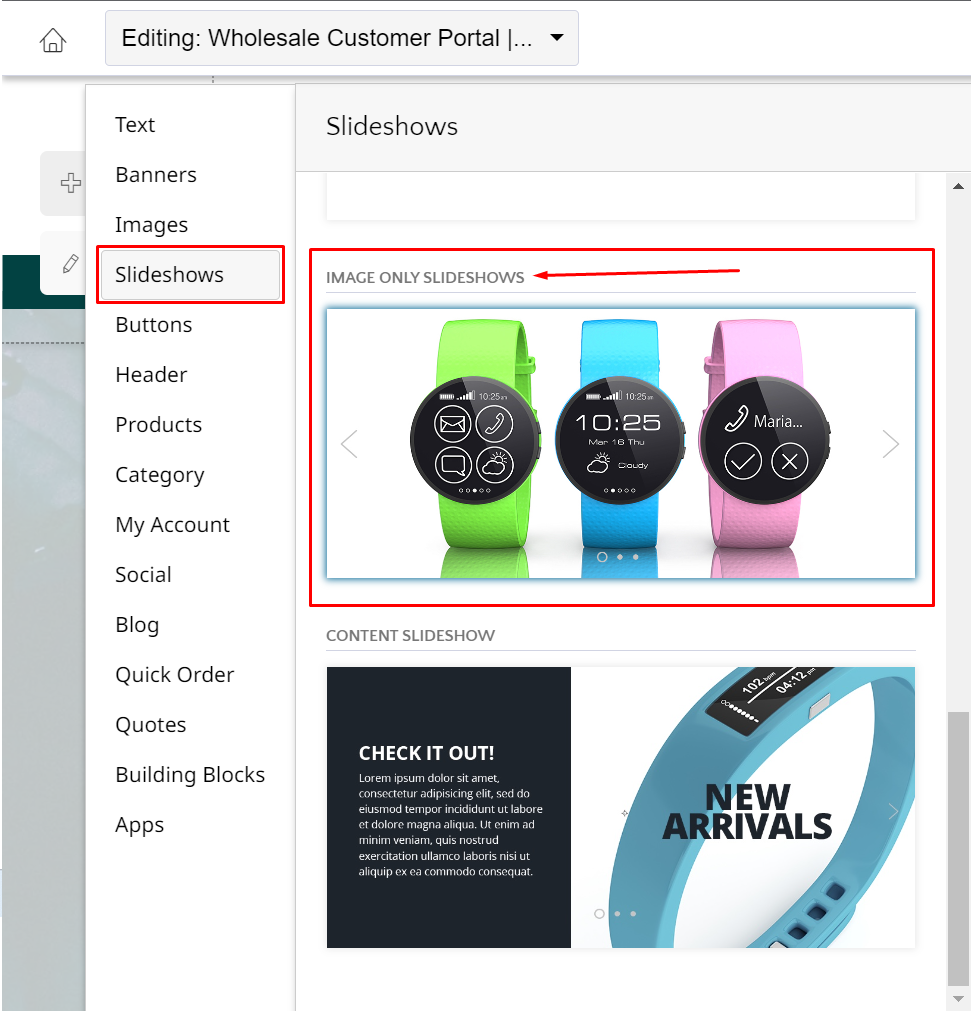
To set a special Mobile image, we must add the IMAGE ONLY SLIDESHOW from the Add Menu.
-
Then click on the slideshow, and hit Edit Image Slideshow.
-
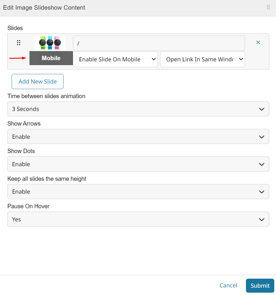
Here you can add slides to be cycled through and adjust the settings for the slideshow.
-
-
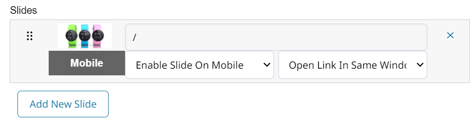
Each of these slides can have 2 images. One full size, and one smaller for mobile. You can also disable the slide on mobile if there is no alternative image.
-
Click on the box below the default image to choose the mobile slideshow image.
-
Use the view switcher to see this slideshow in mobile format.
- Tablet view will continue to use the regular slide show image, but will be resized to fit properly.
-
You may Save & Publish your changes once satisfied with the design of the slideshow.
The height of your slideshow can be changed independently within the Mobile view.
Try using a taller image and stretching the slideshow vertically to display a larger image to mobile visitors.
Updated 3 months ago